jQuery CSSEmoticons đã được Wordpress tích hợp và có trang hướng dẫn cài đặt plugin này. Tuy nhiên Blogger vẫn thiệt thòi là chưa được ứng dụng plugin này. Chính vì thế tôi cố gắng nghiên cứu, thử nghiệm và cuối cùng đã áp dụng được cho nhận xét trên Blogger (jQuery CSSEmoticons plugin for Blogger).
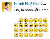
Bạn có thể xem Demo.
Nếu bạn thích plugin này thì hãy thực hiện theo các bước sau đây.
Bước 1. Đăng nhập Blogger, vào Design >> Edit HTML, chọn Expand Widget Templates. Đặt đoạn CSS sau vào trước dòng ]]></b:skin>.
/* jQuery CSSEmoticons plugin 0.2.8Copyright (c) 2010 Steve Schwartz (JangoSteve)Dual licensed under the MIT and GPL licenses:http://www.opensource.org/licenses/mit-license.phphttp://www.gnu.org/licenses/gpl.htmlDate:Sun Sep 20 10:00:00 2010 -0500*//* Basic styles for emoticons */span.css-emoticon{font-family:"Trebuchet MS";/* seems to give the best and most consistent emoticon appearance */font-size:0.65em;font-weight:bold;color:#000;display:inline-block;overflow:hidden;vertical-align:middle;transform:rotate(90deg);-webkit-transform:rotate(90deg);-moz-transform:rotate(90deg);-o-transform:rotate(90deg);width:1.54em;/* note that this is a multiple of this span's font-size,not containing text font-size */height:1.54em;/* so,relative to containing text,width and height are 0.9 x 1.6 = 1.44em */text-align:center;padding:0;line-height:1.34em;-moz-border-radius:1.54em;-webkit-border-radius:1.54em;border-radius:1.54em;-moz-box-shadow:1px -1px 2px rgba(0,0,0,0.5);-webkit-box-shadow:1px -1px 2px rgba(0,0,0,0.5);box-shadow:1px -1px 2px rgba(0,0,0,0.5);border:1px solid rgba(0,0,0,0.25);background-color:#fc0;background-image:-webkit-gradient(linear,right top,left top,color-stop(0.41,rgb(255,204,0)),color-stop(0.56,rgb(255,221,85)),color-stop(1,rgb(255,238,170)));background-image:-moz-linear-gradient(center right,rgb(255,204,0) 41%,rgb(255,221,85) 56%,rgb(255,238,170) 100%);-webkit-transition-property:color,background,transform;-webkit-transition-duration:1s,1s;-webkit-transition-timing-function:linear,ease-in}
/* Styles for two-character emoticons that need more letter-spacing for proportionality */span.css-emoticon.spaced-emoticon{padding-left:0.2em;width:1.34em;letter-spacing:0.2em}
/* This is a dirty dirty hack,because webkit doesn't properly do the padding+width=total-width as it shouldI think the width of the border may be throwing things off,because it's more noticable for small icons */@media screen and (-webkit-min-device-pixel-ratio: 0){span.css-emoticon.spaced-emoticon{width:1.4em}
}
/* Styles for emoticons that need to have smaller characters to fit inside the circle */span.css-emoticon.small-emoticon{font-size:0.55em;width:1.82em;height:1.82em;line-height:1.72em;-moz-border-radius:1.82em;-webkit-border-radius:1.82em;border-radius:1.82em}
span.css-emoticon.small-emoticon.spaced-emoticon{padding-left:0;width:1.82em;letter-spacing:0.1em}
/* Styles for additional colors */span.css-emoticon.red-emoticon{background-color:#eb0542;background-image:-webkit-gradient(linear,right top,left top,color-stop(0.41,rgb(235,5,66)),color-stop(0.56,rgb(235,38,90)),color-stop(1,rgb(250,55,110)));background-image:-moz-linear-gradient(center right,rgb(235,5,66) 41%,rgb(235,38,90) 56%,rgb(250,55,110) 100%)}
span.css-emoticon.pink-emoticon{background-color:#ff8fd4;background-image:-webkit-gradient(linear,right top,left top,color-stop(0.41,rgb(255,143,212)),color-stop(0.56,rgb(255,153,216)),color-stop(1,rgb(255,173,225)));background-image:-moz-linear-gradient(center right,rgb(255,143,212) 41%,rgb(255,153,216) 56%,rgb(255,173,225) 100%)}
/* styles for emoticons that need no rotation,like O_o */span.css-emoticon.no-rotate{transform:rotate(0deg);-webkit-transform:rotate(0deg);-moz-transform:rotate(0deg);-o-transform:rotate(0deg);-moz-box-shadow:1px 1px 2px rgba(0,0,0,0.5);-webkit-box-shadow:1px 1px 2px rgba(0,0,0,0.5);box-shadow:1px 1px 2px rgba(0,0,0,0.5);font-size:0.45em;width:2.2em;height:2.2em;line-height:1.9em;-moz-border-radius:2.2em;-webkit-border-radius:2.2em;border-radius:2.2em;background-image:-webkit-gradient(linear,right bottom,right top,color-stop(0.41,rgb(255,204,0)),color-stop(0.56,rgb(255,221,85)),color-stop(1,rgb(255,238,170)));background-image:-moz-linear-gradient(center bottom,rgb(255,204,0) 41%,rgb(255,221,85) 56%,rgb(255,238,170) 100%)}
span.css-emoticon.no-rotate.red-emoticon{background-image:-webkit-gradient(linear,right bottom,right top,color-stop(0.41,rgb(235,5,66)),color-stop(0.56,rgb(235,38,90)),color-stop(1,rgb(250,55,110)));background-image:-moz-linear-gradient(center bottom,rgb(235,5,66) 41%,rgb(235,38,90) 56%,rgb(250,55,110) 100%)}
span.css-emoticon.no-rotate.pink-emoticon{background-image:-webkit-gradient(linear,right bottom,right top,color-stop(0.41,rgb(255,143,212)),color-stop(0.56,rgb(255,153,216)),color-stop(1,rgb(255,173,225)));background-image:-moz-linear-gradient(center bottom,rgb(255,143,212) 41%,rgb(255,153,216) 56%,rgb(255,173,225) 100%)}
/* Styles for emoticons that need to be rotated counter-clockwise,like <3 */span.css-emoticon.counter-rotated{transform:rotate(-90deg);-webkit-transform:rotate(-90deg);-moz-transform:rotate(-90deg);-o-transform:rotate(-90deg);-moz-box-shadow:-1px 1px 2px rgba(0,0,0,0.5);-webkit-box-shadow:-1px 1px 2px rgba(0,0,0,0.5);box-shadow:-1px 1px 2px rgba(0,0,0,0.5);background-image:-webkit-gradient(linear,left top,right top,color-stop(0.41,rgb(255,204,0)),color-stop(0.56,rgb(255,221,85)),color-stop(1,rgb(255,238,170)));background-image:-moz-linear-gradient(center left,rgb(255,204,0) 41%,rgb(255,221,85) 56%,rgb(255,238,170) 100%)} span.css-emoticon.counter-rotated.red-emoticon{background-image:-webkit-gradient(linear,left top,right top,color-stop(0.41,rgb(235,5,66)),color-stop(0.56,rgb(235,38,90)),color-stop(1,rgb(250,55,110)));background-image:-moz-linear-gradient(center left,rgb(235,5,66) 41%,rgb(235,38,90) 56%,rgb(250,55,110) 100%)} span.css-emoticon.counter-rotated.pink-emoticon{background-image:-webkit-gradient(linear,left top,right top,color-stop(0.41,rgb(255,143,212)),color-stop(0.56,rgb(255,153,216)),color-stop(1,rgb(255,173,225)));background-image:-moz-linear-gradient(center left,rgb(255,143,212) 41%,rgb(255,153,216) 56%,rgb(255,173,225) 100%)} /* Styles for animated states */span.css-emoticon.un-transformed-emoticon,span.css-emoticon.animated-emoticon:hover{/* font-size:inherit;font-weight:inherit;vertical-align:inherit;line-height:inherit;font-family:inherit;*/letter-spacing:inherit;color:inherit;overflow:visible;transform:rotate(0deg);-webkit-transform:rotate(0deg);-moz-transform:rotate(0deg);-o-transform:rotate(0deg);background:none;background-image:none;box-shadow:none;-moz-box-shadow:none;-webkit-box-shadow:none;border-color:transparent}
Bước 2. Đặt trước thẻ </head> với dòng code sau đây.
<script src="http://cdn0.alfajango.com/javascripts/jquery-1.4.2.min.js" type="text/javascript"></script>
Nếu bạn muốn gọn hơn thì kết hợp Bước 1 và Bước 2, chỉ cần đặt đoạn code dưới đây vào trước thẻ </head>.
<link href="http://cdn0.alfajango.com/stylesheets/jquery.cssemoticons.css" media="screen" rel="stylesheet" type="text/css" />
<script src="http://cdn0.alfajango.com/javascripts/jquery-1.4.2.min.js" type="text/javascript"></script>
<script src="http://cdn0.alfajango.com/javascripts/jquery-1.4.2.min.js" type="text/javascript"></script>
Bước 3. Đặt đoạn code sau đây vào trước thẻ </body>.
<script src='http://dl.dropbox.com/u/684300/jquery.cssemoticons.min.js' type='text/javascript'></script>
<script type='text/javascript'>
$(document).ready(function(){
$('.comment-body p').emoticonize({
//delay: 800,
//animate: false,
//exclude: 'pre, code, .no-emoticons'
});
})
</script>
<script type='text/javascript'>
$(document).ready(function(){
$('.comment-body p').emoticonize({
//delay: 800,
//animate: false,
//exclude: 'pre, code, .no-emoticons'
});
})
</script>
Bạn cần download file cssemotiocons.js về và upload lên host để xài riêng cho blog của bạn.
Bước 4. Tìm dòng <b:if cond='data:post.embedCommentForm'> và đặt trước nó với dòng code sau đây.
<img border='0' height="70" src='http://bit.ly/goWvip' width="550"/>
Lưu Template là OK.
Đối với các công cụ trình duyệt hỗ trợ plugin này thì các biểu tượng cảm xúc trông như thế này.
Còn đối với IE thì hiển thị như thế này.

Và đây là chuỗi các nhóm ký tự tương ứng với các biểu tượng cảm xúc ở trên.
:c) :^) :-D :-( :-9 ;-) :-P :-p :-b :-O :-/ :-X :-# :'( B-) 8-) ;*( :-* :-\ ?-) : ) : ] = ] = ) 8 ) : } : D 8 D X D x D = D : ( : [ : { = ( ; ) ; ] ; D : P : p = P = p : b : O 8 O : / = / : S : # : X B ) : | : \ = \ : * : > : < :) :] =] =) 8) :} :D :( :[ :{ =( ;) ;] ;D :P :p =P =p :b :O :/ =/ :S :# :X B) :|
Hoan hô, đây quả là một kỳ công của Steve Schwartz và cũng là một nỗ lực tuyệt vời của Huỳnh Nhật Hà :ha để phổ biến plugin này cho cộng đồng Blogger.
No comments:
Post a Comment